The steady pace of consumer spending growth explains why the blue bar on the right side of the chart held up.
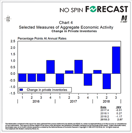
Why did the gray bar drop so sharply?
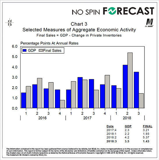
Because inventories rose sharply.
The large jump that you see here could have several causes. The first is that some of the rise in imports that was behind the number we saw on the previous page ended up in inventory. This could be by design. If I know that I am going to have to pay more in tariffs down the road, it behooves me to double or triple order now and store the goods. Another reason inventories could be up is that goods I built for export are not being sold because of tariffs abroad. This is not what I was planning for.
Inventories can rise for good and bad reasons. Until we know which kind is dominating the process we can’t be sure how to read this piece of information. But we can but a big red circle around it as something that makes us want to discount the news of the headline rate of GDP growth in this report.