A Special Report from Dr. Dieli
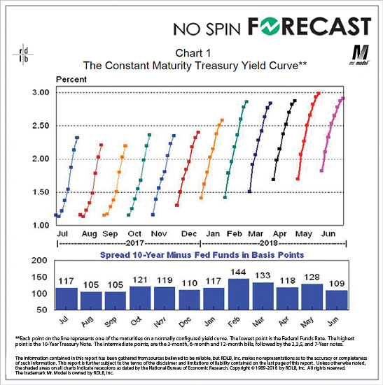
When I published this chart in the July 2018 editions of the Prospects and Perspectives and the Overview and Outlook reports I said that I thought that what had taken place so far this year was a compression of the yield curve and not a flattening of the yield curve. This brought forth several questions about what those terms meant, and, could I illustrate the difference. The following charts should do the trick. And, if they don’t, let me know and I will try a different approach.
As you can see in the lower chart, the yield curve at its widest point over the past 12 months stood at 144 Basis Points in February. In June we were at 109 Basis Points. But, as you see on the upper chart, the shape of the curve has hardly changed. This, to me, is a compression.
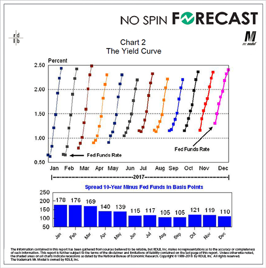
That same phenomenon had been in evidence for some time. Here we go back a bit further, and we see that same pattern. We took 68 Basis Points off the length of the curve over the course of 2017, but the shape of the curve was essentially unchanged over the entire period.
Again, a compression and not a flattening.
And, several of you might recall that when the distance between the ends of line reached 105 last August and September I said that I did not think we were looking at the conditions associated with the flattening and inversion of the yield curve.
To read this full report, login to your subscription account. To register for a monthly subscription, click HERE and view this Special Report under the Special Reports tab on your membership dashboard.