For those of you who sat through all three parts of our Special Report on manufacturing employment, a lot of what you will be seeing here will look familiar. But, for those who are just joining the proceedings, I need to give you a little bit of background on what these reports are all about.
Every month we publish the Employment Situation Report in which we go into the first level of detail on the jobs numbers that are contained in the two surveys of employment. Going into just the first level of detail gets us a report that runs between 35 and 45 charts. And, as several of you have pointed out, that is about as long of a report as I can reasonably expect you to read.
The problem is that the truly meaty stuff is at the next level of detail, the level at which we begin to disaggregate the totals we review in the Employment Situation Report. When we looked into manufacturing employment, we ended up with enough material for three reports. This time we should be able to get through health care employment in one.
There are two reasons why we are doing the special reports. The first is to improve our understanding of the current level and trend of total nonfarm payroll employment. The second is to improve our understanding of what to expect from the employment numbers as we approach the next cycle peak.
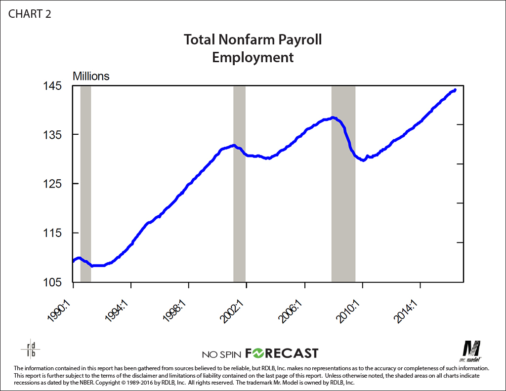
We will endeavor to continue to implement the suggestion of several readers: let the pictures tell as much of the story as possible. Fortunately, as you will see in a moment, most of the pictures in this report do just that.
Read the full special report. Click here >>