![]()
The S&P 500 is approaching the ‘Zone of Death’
by T. Erik Conley
Founder and CEO of Zen Investor
June 9, 2015
Like most investors who have been through a few market cycles, I try to stick to a few trading rules in order to avoid making dumb market-timing decisions:
- Don’t fight the tape.
- Don’t fight the Fed.
- Don’t fight the business cycle.
- And don’t get ahead of your indicators.
These rules have one thing in common. They are there to remind me not to jump the gun when the market goes through its periodic bouts of volatility. As more and more market pundits climb aboard the correction-is-just-around-the-corner bandwagon, I’m trying hard to resist the temptation to join them. With a positive tape, a friendly Fed and a healthy business cycle, I don’t want to get ahead of my indicators. Nearly every time I’ve done that, I’ve lived to regret it.
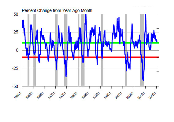
The Zone of Death (ZOD) indicator — a phrase that was coined by economist Robert Dieli at NoSpinForecast — is based on the year-over-year percentage change in the S&P 500 index SPX, -0.11% When Dieli plotted this line on a long-term chart, he noticed that when it passes through the 10% level from above, it tends to accelerate to the downside until it gets to a reading of minus 10%. So he described the area of the chart between plus 10% and minus 10% as the Zone of Death because once the line entered this area, there was a good chance that the bull market would die. Here’s what the chart looks like, going all the way back to 1955:
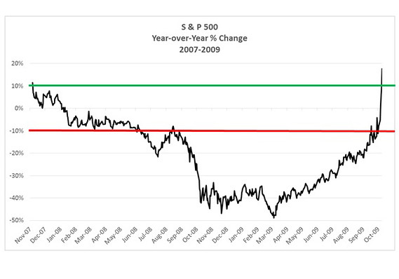
A keen observer will note that the line on the chart has a tendency to bounce around as it penetrates the top of the ZOD. These false signals create a lot of noise, and make the indicator unreliable as a forecasting tool. So, I ran the numbers using a 5% threshold, to see whether this would improve the reliability of the signal. It did. When the line penetrates 10% from above, it’s a yellow flag. But when it penetrates 5%, it becomes a red flag. There are far fewer false signals. The chart below shows what happened in the 2008-09 bear market:
Today the line stands at 7.85%. This means that for this indicator, there is a yellow flag in place. But it would be premature to take any action at this point, because the primary trend of the market is still higher, and the Fed is still supporting the risk-on trade. Combine these two positives with the fact that the business cycle is still in an expansion period, and you reach the conclusion that at least for the time being, you should stay invested in equities. Here is what the ZOD chart looks like today:
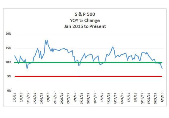
As you can see, the line has been moving in and out of the ZOD since the start of 2015. It is now in the “yellow flag” area of the chart. The only way to avoid getting to the “red flag” area, is by making a series of new highs in the market. It’s also worth noting that this is only one indicator, and it’s always wise to look for confirmation from other indicators before making changes to your portfolio. Even though the market is nearing the Zone of Death, don’t get ahead of your indicators.