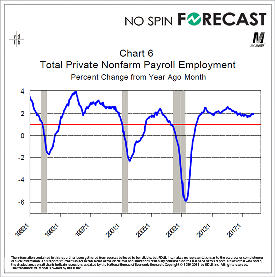
Well, we can shift from using the level of the series to using the year-over-year percent change in the series. This gets us the smoothness we got by doing the averaging of the level as well as a level of consistency that will allow its use to more finely date the cycle phases.
Here you see that the there are no recessions when this line is north of 1%. And, you also see that the end of the recessions are very close to the point where the line reverses direction and starts moving back towards zero. Why does this matter? Because the process by which the National Bureau of Economic Research [NBER] determines the location of the gray bars on the chart can take a year from the time the event actually happened.
With this chart you can estimate, in real time, where the NBER start and end dates would be.